Saturday, April 30, 2005
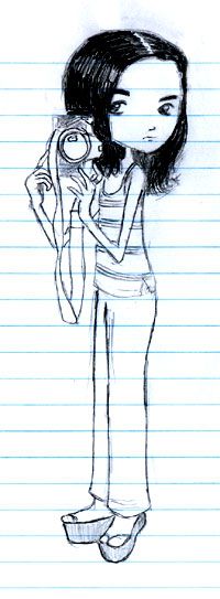
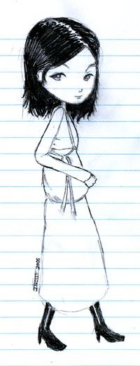
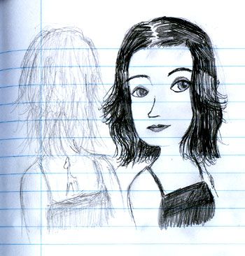
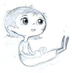
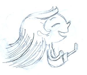
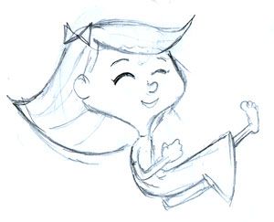
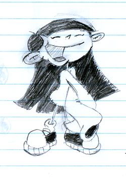
It felt like a million years since I last drew. Started working on Adobe Illustrator. The whole day I kept annoying Daniel asking him "how do you this?" and "how do you do that?". Sorry Edmundson.
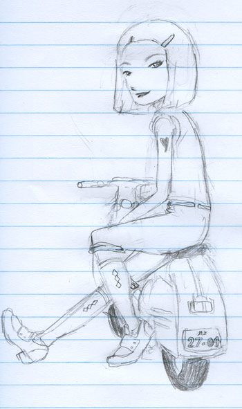
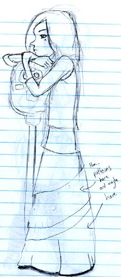
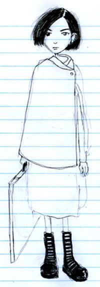
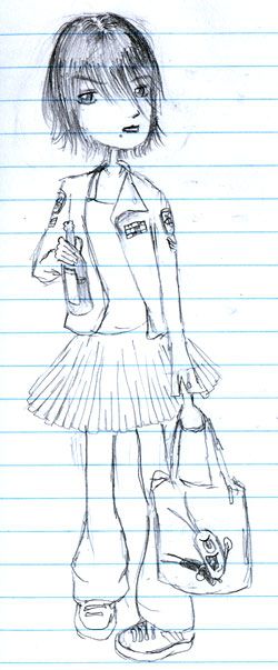
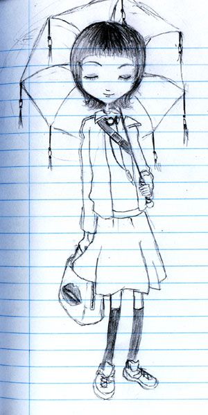
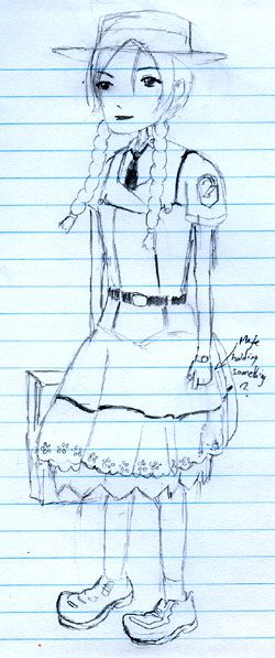
The top of this illustration is entirely based on the Patlabor uniform but I must emphasize that I don´t intend to draw cosplays. Cosplay is mimicry. There is no problem in identifying yourself with movie and animation characters. The problem is to want to become them. I admit that I once I even thought of doing cosplay, but thank God I´m a cheap bastard.
Friday, April 29, 2005
Thursday, April 28, 2005
Tuesday, April 26, 2005
Monday, April 25, 2005
As promised two posts. The top one was a real challenge. I completely changed her look. The old version can be seen here.
It was scary to watch the Patlabor OVAs and first two movies. Not that it has any shallow frightening scenes. Mamoru Oshii´s evolution from the typical format "girl meets robot" series (1989) to the tense political movie (1993) is jawbreaking. It´s hard to believe that they were done by the same person.
Sunday, April 24, 2005
Saturday, April 23, 2005
Friday, April 22, 2005
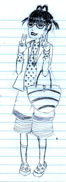
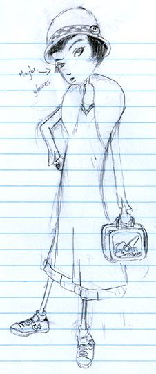
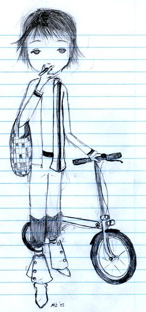
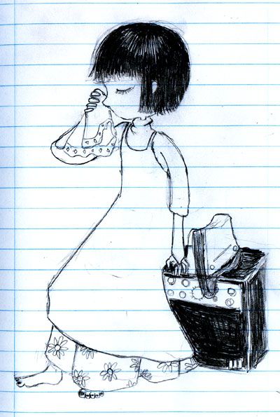
The beginning of the twentieth century defines luxury with simplicity. I tried to individualize this elegance by mixing some modern details. Like Samurai Champloo. Couldn´t think of a bag so a Patlabor lunchbox was the solution.
I just watched the Patlabor OVAs. I didn´t like it that much, but I believe it was very important to watch it. Released in 1988, it was probably one of the first animes to try to place the giant robot genre in a real world situation. From the initial six episodes, you can see the first steps of director Mamoru Oshii towards his dense political science-fiction world as seen in his later works like Ghost in the Shell and Jin Roh. Maybe I´m crazy, but I also can see major influences on 1995´s Evangelion.
Wednesday, April 20, 2005
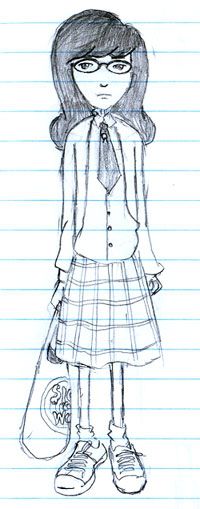
Daria´s look updated.
MTV helped create breakthrough cartoons that reshaped American animation. Liquid Television (91), Beavis and Butthead (93), Aeon Flux (95), The Maxx (95), and Daria (97) stand as some of the most original animated TV shows ever made. It also gave a big help to other equally important works such as Nickelodeon´s Ren & Stimpy (91) and Comedy Central´s South Park (97). It was a time when MTV still aired videoclips, remember? Unfortunately this phase is long gone. The plague of reality TV and hundreds of idiot shows infest this completely sold-out network. Don´t turn the TV on. It´s a sick sad world.
Tuesday, April 19, 2005
Monday, April 18, 2005
Sunday, April 17, 2005
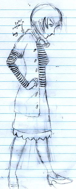
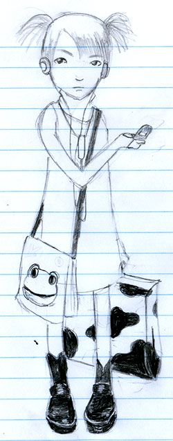
It´s official. I´m currently obsessed about bags. But they are so pretty and useful...
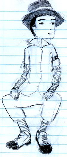
Ozzy Osbourne said that if you want to look different today, don´t tattoo yourself. It´s pathetic to see all these kids doing tattoos and piercings just to show their friends how "wild" and "crazy" they are. I can only see the loss of lots of potential blood donors for crappy reasons.
Without the tattoo the illustration would look too prêt-à-porter. This tattoo comes from Yu Yu Hakusho´s character, Hiei. A couple days ago, I was asking a friend if he still liked this anime. He said that he liked it because it is connected to his childhood. This is the typical answer I get from almost every so called "otaku" (someone who thinks he´s an anime fanatic). When I was a teenager, YYH was one of the first animes I ever watched. Since I had very little to compare to, I liked it very much. I`ve grown. I´ve watched lots of other titles. Then I rewatched one episode at Cartoon Network when I returned from Japan. I couldn´t bear the whole episode. My thoughts were "was it always like this?" or "how could I stand these dialogues?" Nostalgia is an important feeling but dangerous when it becomes pure escapism.
Thursday, April 14, 2005
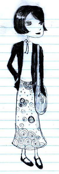
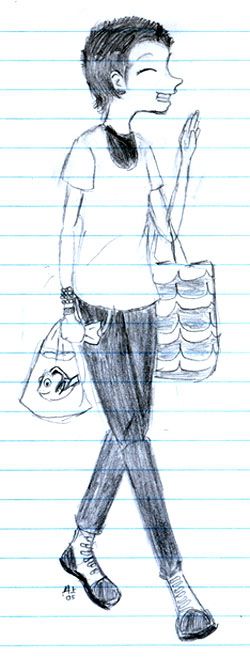
I´ve drawing a lot but am I focusing enough on urban fashion? I guess this post is the results of my worries. Her jacket is based on a fake military one I bought on a second hand clothes shop in Japan. The skirt came to my mind as I remembered the Toxic Avenger movie. And I just had to put Plankton on the bag.
Daniel was the one who insisted that I watched Spongebob. I had never seen it and thought that it was just another uninteresting Nickelodeon toon. I was hooked instantly by the great plots. It rises as Ren and Stimpy´s heir but less... extremist. Finally a cartoon that makes Cartoon Network shiver.
Wednesday, April 13, 2005
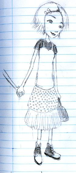
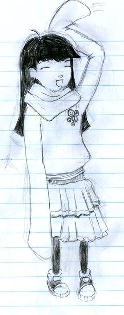
My excuse? No space. At least she is happy. Not many drawings here end up with a smile.
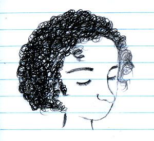
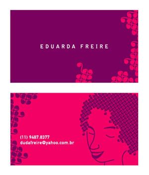
A few days ago, a friend of Daniel and I asked him to do her a contact card. He asked me to draw her. He had already shown me a pattern he did that looked like her hair. On my sketch I emphasized two distinguinshing details of her head: the hair and the nose. Later I e-mailed him the drawing above. Below is the option she chose.
He said he missed the mouth. Really liked the colors.
Tuesday, April 12, 2005
I was blown away when fliti sent me the link with Kristen´s Sketch Blog. Simple and brilliant. As you might notice she is the inspiration of this blog (yes, I´m an unoriginal bastard). Unlike her, I have no idea of how to color (or draw). I used to paint with watercolor and oil paint in school but my complete inability of using a brush traumatized me. I also have no idea of how to choose colors. That´s why my excuse is to say that grayscale is more "romantic".
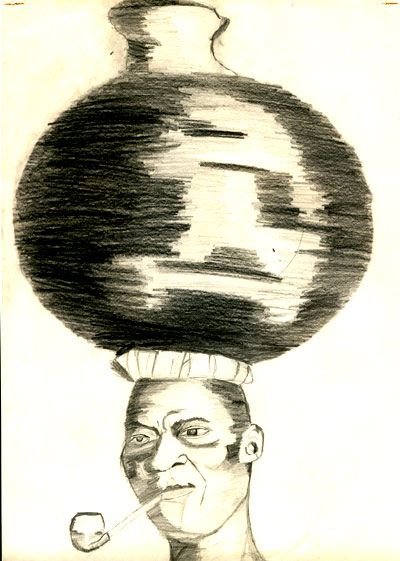
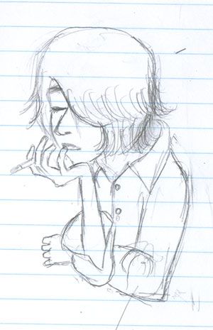
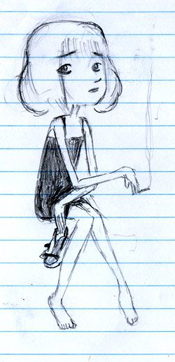
I don´t smoke. Don´t even want to. Hey now, check your change. Addictions are expensive and I´m a cheap bastard. But the act of smoking is very cool looking.
Monday, April 11, 2005
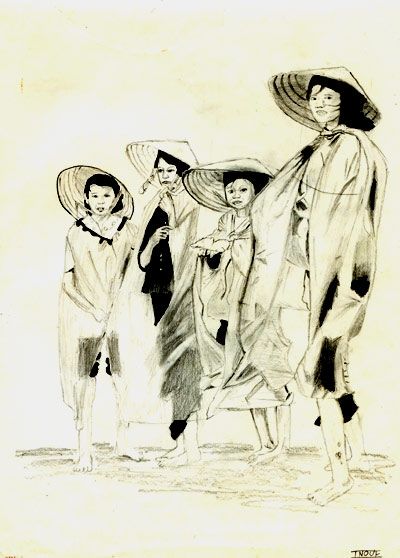
I´m really busy reading L´Empire de l´éphémère. I need to finish it to write a paper justifying my final university project. Very interesting book by the way. Even if you aren´t into fashion. That´s why today I´ll cheat and post my first serious archived drawing. Did at school. Don´t remember in which grade.
It reminds of these protests happening in China. While Japan seems too stubborn to swallow it´s pride, China seems to hypocrytical about it´s current violent regime.
Sunday, April 10, 2005
Request from a friend. The word is sadness. I believe he meant melanchonly and apathy. The first one looks like she just wants to go home while the second looks worried.
Lots of people indicated me the Illustration Friday website. Great idea of having lots of styles on suggested themes. Very easy to submit and long due dates. The problem is viewing the works. If one hundred people submit, you´re one hundred clicks away from seeing them all. Doing once in a lifetime shouldn´t kill you. But doing it once a week?
Saturday, April 09, 2005
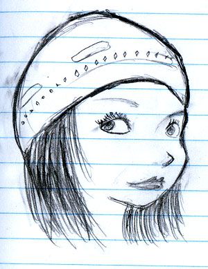
Now this one was a challenge. I love pretty women wearing spectacles. The problem is that I purposely create a greater distance between the eyes. I did about seven trials before this one.
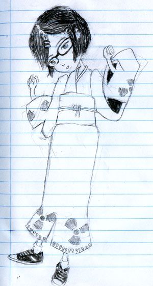
I´m currently watching Samurai Champloo and it is one of the most original animations I´ve seen these recent years. "This work of fiction is not an accurate historical portrayal. Like we care. Now shut up and enjoy the show." Rap music in the opening and R&B in the ending. Finally a series with lots vision and guts to kick around the samurai genre.
Inspired by Champloo. I tried to mix a bit of Jin and Fuu (sorry Mugen).
Friday, April 08, 2005
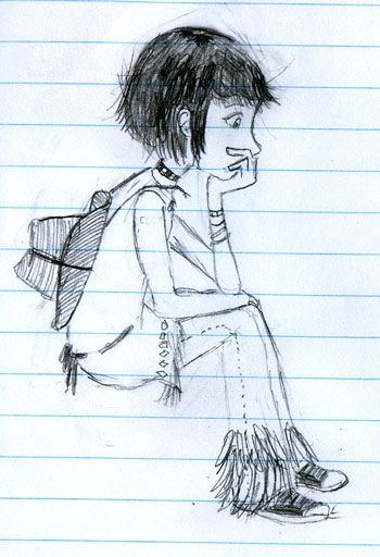
I guess colors and patterns can complete this sketch quite well. It was sort of tough deciding how the face would look sideways. Glad that is over. Thanks to the White Stripes.
Thursday, April 07, 2005
The three books I ordered finally arrived. L´Empire de l´éphémère, Du Nomadisme, and Fruits Postcards. Of course I just wrote the original French titles because it makes me look clever. I started learning French but I gave up on the beginning. Je ne parle pas français.
Today´s drawing is based on the third... book. It´s not actually a book. It´s another version of the popular Fruits photo book... but instead of pages you have loose postcards. It seems more like a giant set of cards. It´s a very original presentation for these beautiful photos. I altered just some bits and pieces. I really liked experimenting with wobbly legs. Sometimes I get too worried about physical aspects like "the distance between the elbow and the hand should be equal to..." and this just limits me too much. As Daniel told me, look at the size of their heads! They´re huge!
Wednesday, April 06, 2005
This time I tried thicker eyebrows. Just like in reality, they make a lot of difference. On Hey Arnold! the two "tough" girls of the series, Helga and Patty, have each a single extended thick eyebrow that gives them a mean look. Do people with thick eyebrows look meaner?
Last post I asked two friends what they thought of high heels. I was feeling guilty of drawing yesterday´s post in high heels because my common sense understands that it must be a painful experience for women. Even though being extremely thin, Zilmara told me that being elegant is painful. Camila, who´s also very thin, wears them because of her job. The impression I got is that she became accustomed, but she also told me she loves her All Star shoes.
I value being comfortable a lot. I only have boots because I hate when my socks get wet. Last month I attended a wedding wearing my converse sneakers. My brother was pissed off and the groom even joked asking my brother, "who the hell is this punk?" That´s why today´s post wears platform sandals, Zilmara´s favorite footwear type.
Thanks once again to PJ Harvey. The drawing is based on a photo of the CD booklet of her latest album Uh Huh Her.
Tuesday, April 05, 2005
Never be afraid of erasing your work. I had done the whole face but I only liked the eyes. And thanks to my brother who bought me a new eraser. Hopefully my sketches will be less smudged.
As Beavis once said, "Progress is cool". The thin girl series is evolving. I have a strong feeling that this is the style I´m going to use on the project. Thanks to PJ Harvey for modeling.
Monday, April 04, 2005
A couple days ago I was talking to this friend about action in animation and I guess here I can extend my thoughts. The poor representation of her above is obviously a simplification of the real image. To create a similarity between both, I had to emphasize in two details: the hair (although I haven´t seen her in a while) and her tatoo. Apart from these two, no one could differentiate her from any other drawing in this blog.
Age for example. Animations have to work with the least number of lines possible. When characters are created, visual aspects like height, body posture, and facial lines define the age of a character. Notice the faces. In several mangas you´ll see people growing old (unlike many American comic books). From childhood to adolescence height usually plays an important role, but from adolescence to an extended adulthood one simple line below each eye makes a whole lot of difference.
The fewer details give a greater liberty in lots of perspectives. With less things to worry about, the borderline of the implausible is pushed further away.
For a further view of this subject I reccomend the last episode of the Evangelion TV series. Animenation´s John Oppliger once answered a question that also might help.
Sunday, April 03, 2005
These are the original sketches of a T-shirt design I sent to a contest. The backup CD that had the layout was ruined (the top part peeled off and it didn´t read anymore) so be careful and store your CDs safely. It didn´t win anything but what bothers me it´s that still today I don´t feel comfortable with the position of the drawing on the tee.
Saturday, April 02, 2005
Friday, April 01, 2005
Lately I´ve been watching Codename: Kids Next Door a lot. One of the things I really like about it is that it works like Bobby´s World and Rugrats, but instead of alternating between the "children´s world" and the "real world" the children in KND never leave their imaginative views of a never ending battle against the adults. Another thing I like is that, although episodes can be seen independently, there is a main plot rolling along the episodes. It´s not a complicated story, just mindless fun.
The production of KND is remarkable for a channel in which all productions seemed to be unaware of the world outside the Tom and Jerry / Bugs Bunny format. It´s strange to notice how Cartoon Network sticks to the slapstick humor so strongly. Even though they have the biggest archive of cartoons on network television, they continue to emphasize on the same old type of visual jokes. If you watch Bugs Bunny cartoons through the eras you´ll even see the exact same stories with only slight visual differences. Unfortunately, a similar critic can be said about Japanese animation. In 2003, over 100 animations were produced in Japan. I didn´t watch them all (I sort of have a life) but I can guarantee that about 99% of them don´t have anything new to offer. I recently read a very interesting article by Malcom Gladwell. "Old words in the service of a new idea aren't the problem. What inhibits creativity is new words in the service of an old idea." We shouldn´t expect a revolution from all animations but we should at least try to find from where the original ideas came from.
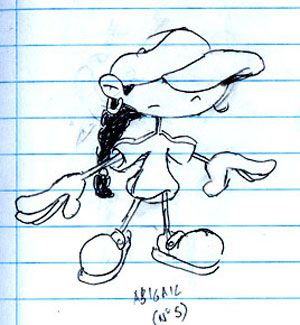
Finally, the first drawing is of one the main characters: Number 5. A great point about American cartoons is the liberty they choose to have with character design. At first I thought she would be just another of those "put at least one black sidekick-stereotype there so they don´t call us racists", but surprisingly KND is very democratic about giving each kid interesting personalities and individual episodes. I love the fact that (at least in my head) KND has some kind of very sad fatality because as seasons go by, they are closer to their inevitable destiny of becoming their worst enemies: adults. Since Number 5 is my favorite character in KND, I imagined how she would look like as the enemy.
Subscribe to:
Posts (Atom)